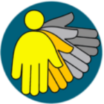
Our network name and logo.
We wanted a name and logo for our network that would represent our aims and the perspectives of disabled people in Granma. Through the disabled people’s organisations, we organised an open contest to submit a name or logo, along with a rationale.
The name selected for the network, “Toma Mi Mano” (Take My Hand), was proposed by Macyulenia Fuentes Reyes, from Manzanillo. She explained that the name suggested equal partnership and mutual support between the two countries and between universities and disabled peopl’s associations.
Among the many talented participants who proposed logos, one logo stood out. The design was by Pablo Riera, hailing from Manzanillo.
A Winning Logo by Pablo Riera

Pablo Riera’s logo was selected as the winner of our contest due to its exceptional qualities. The logo reflects a perfect blend of professionalism and creativity. This is Pablo’s explanation of his design.
It begins with the idea of two figures that integrate with each other: a circle and a hand. The union of both figures can suggest the image of a person, but it can also represent the disabled people’s associations or a university.
The figure of four elements suggests the four associations, but also the four universities from the two countries united in a common interest.
Visually, there is rhythm here, which gives us, or lets us imagine, the movement of a hand, both to greet and offer and to receive, which is the fundamental idea behind the project.
Four colours have been used to represent the project: two warm colours and two greys, because there are two countries involved in this dream: the United Kingdom and Cuba. There are also two types of organisations that are carrying out this project: the associations and the universities. Yellow represents hospitality, creativity, tranquillity and optimism, as well as orange, which implies joy, kindness, innovation, energy and fun. Grey and silver suggest calm, solidity, cleanliness and seriousness, everything necessary for both countries, the associations and the universities to work together.
In the background there is a circle, which has the intention of showing the continuity of this work, which always returns to the same place and starts again, does not stop, never ends.
I took the turquoise blue of this circle from the logo of the Nottingham University as kindness or gratitude to it for being one of the creators of this project, designed for people with the Disability Situation in our country, especially in our province of Granma.
Celebrating Diversity and Talent
The logo contest was not only a platform for designers to showcase their skills but also an opportunity to celebrate diversity and talent. We are grateful to all the participants who contributed their unique ideas and designs.
These were some of the other designs the judges loved


